

Every month the leadership team meets to review the work through charts.
Those reports show whether visits rose or fell in percentage terms, whether cost per click went up or down, and whether the newsletter open rate is holding. Someone nods. Someone asks whether that is a good result. No clear answer arrives. The meeting ends. Not one decision differs from the hour before.
This is not the exception, it is the norm. In most companies marketing measurement has reached a point where there is more data than ever and less clarity than management needs.
The visualisation is not at fault. A bad chart is irritating, but it can be fixed in a couple of hours. The real fault sits deeper: the measurement system was built around tools rather than around decisions.
A metric without a decision is decoration
Google Analytics, a CRM, ad platforms and artificial intelligence all supply plenty of information, yet none of them decides for the company which question matters most right now. A tool measures what it is able to measure; the leadership team needs an answer to what it is currently deciding. Those two coincide less often than people assume.
The check is simple. Take any number from your report and ask what happens if it moves by twenty per cent. If the answer is “good” or “bad” rather than “then this is what we do next”, it is not a management metric. It is decoration.
Reports are full of decoration because decoration comes free and in unlimited supply. A metric that supports a decision demands something else: an agreement, an unambiguous definition and an accountable owner. No platform supplies those three.
From question to learning
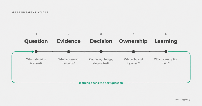
Measurement that works moves through five steps, always in the same order.
Question. Not “how are we doing”, but: is the new positioning bringing in more enquiries of the right profile?
Evidence. The choice of which data will answer that question honestly. Usually not the data that is easiest to obtain. The quality of enquiries, what is said in sales conversations and the progress of deals tell you more than a session count, and they cost more effort.
Decision. A good metric has to help you choose between four options: continue, change, stop, or test the next hypothesis. A metric that cannot move you towards one of those four is not needed for the decision.
Ownership. Accountability is hard without the authority to decide. Ownership is an agreement on who acts and by when. A metric with nobody answerable for it is information, not management.
Learning. Which assumption held and which did not. Without this step the same discussion repeats every month, only the numbers have changed.
The loop closes here, because learning produces the next question. It is not the same question, but a sharper one, because the previous loop narrowed the uncertainty.
Remove any one step and the loop stops turning. What is left is a straight line that ends in a report. That is what most dashboards actually do.
Three levels, and the one the board needs
Metrics fall into three layers, and the confusion starts the moment they are presented together.
Business outcomes show whether marketing supports the company’s goals: revenue, profitability, customer lifetime value, the quality of the sales channel. They matter most and they arrive after the fact. In a professional services business a purchase decision can take months to mature, which means a report is largely measuring the previous period’s work.
Leading indicators give earlier warning of whether the desired outcome is likely: the share of enquiries with the right profile, decision-maker involvement, repeat visits. They come with one condition that is often ignored. The link to a business outcome has to be verified, not assumed.
Activity and diagnostic metrics – clicks, impressions, sessions, form abandonment – help a specialist understand what is happening. They are necessary in daily work. In this form they do not belong on the board’s agenda.
Mixing the layers is the most common error. Put revenue and cost per click side by side on one slide and the reader loses any sense of which of them means anything, and the discussion drifts to wherever the number is larger.
When the metric becomes the target
In 1975 the economist Charles Goodhart recorded an observation later condensed into a familiar line: when a measure becomes a target, it ceases to be a good measure.
In marketing this plays out predictably. The team is judged on the number of leads. The number starts to rise, because it is easy to raise: a broader audience setting, a lower qualification threshold, a shorter form. Sales complains that the leads are poor. Marketing shows a chart where the growth is plain to see.
Both are right and neither is lying. The number is true. It simply no longer measures what it measured before it became the target.
A measurement system is not a neutral instrument; it is better understood as an incentive. People usually respond to an incentive faster than management can rethink it. So before choosing a metric it is worth asking what happens when somebody starts working that number deliberately in their own favour. If the answer is “something useful”, the choice is sound. If the answer is “the number grows and the business does not”, something is wrong and a different metric is justified.
Human ingenuity comes with all of this, and it can be uncomfortable for management. Punishing a weak result teaches people to hide problems, and a system where a bad number cannot be shown honestly produces attractive reports and slow decisions.
One example
A professional services firm wants to increase the share of larger strategic projects in its work.
Website visits, ad clicks and newsletter opens say nothing about that goal, even though those three usually stand first in the report.
A working set is small:
Business outcome: the value of strategic projects won.
Leading indicator: the share of enquiries with the right profile, and decision-maker involvement in the very first conversation.
Diagnostics: which topics and pages produce those enquiries.
And one more thing no tool provides: what clients actually ask about in sales conversations, and what they fail to understand.
This approach does not prove causation. It does create a testable link between activity and outcome, which is more than most dashboards offer.
Where to start
Not with a new tool, and not with the whole system at once.
Pick one decision you want to make better, and give it one business outcome and two or three leading indicators. Agree what each of them means precisely and where the limits of the data lie. Name an owner. Review in a month what you learned, and only then expand.
The architecture can be complete, but the first implementation has to be narrow, because a narrow thing can be verified. The same logic underpins how MACO connects growth and measurement to the rest of the picture.
Artificial intelligence speeds up the manual work here: it consolidates data, spots anomalies, proposes hypotheses. It does not take over accountability for the decision, because interpretation needs context and a person who answers for the outcome.
Good measurement does not mean more numbers. It means an agreement on which question is being answered, which evidence is trusted, and what will be done differently as a result.
If you would like to discuss which metrics would genuinely help your company decide, write to kristina@maco.agency.
Add comment
Comments